Packet #3:
art making:
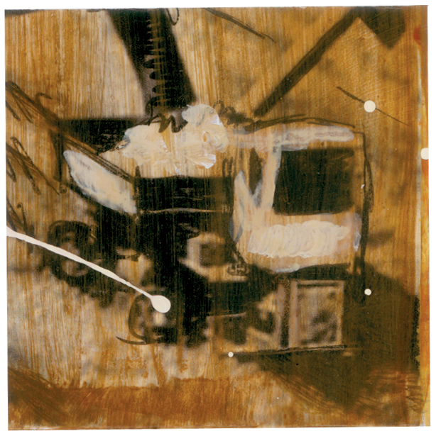
:: I started this packet with art making. I was so turned on by the multiple canvas gridded piece prior to this that I tackled another. This time I ventured back to the "dark side" sharing my disgust with waste and pollution. It is so opposite of my "home" space where I can watch the full cycle of an object. Even the paper-based items I burn in a barrel get returned to the earth and offer nutrients to my gardens. Recycling is not as convenient out where I live - I have to drive it a couple towns over, but I know it's worth it.Acrylic paint, inkjet printed images manipulated in Photoshop, artist' black permanent pen, acrylic stamping, acryilic paint squirted through a bottle, on 185# acrylic paper.
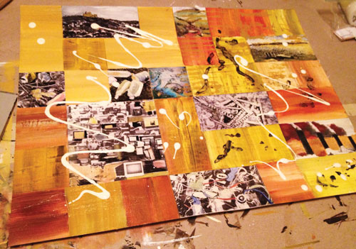
Unlike the previous piece, I started with an intact substrate knowing I'll cut it apart later.
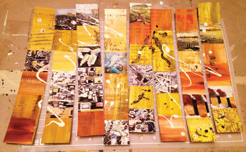
The cutting process begins...
These are gorgeous little paintings in themselves. That's why I'm loving this grids painting process. I started with the composition intact this time and then cut them apart. I'll make them look like the squares of a solar panel by cutting the corners off (maybe).
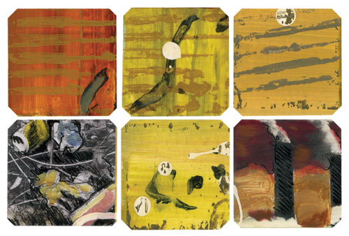
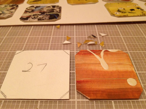
A little scary cutting corners off. There's no turning back once you cut the first one. Yipes.
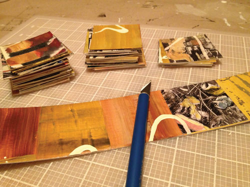
What can I do with all the little triangle corners? I can't throw them away.
Now to re-assemble.
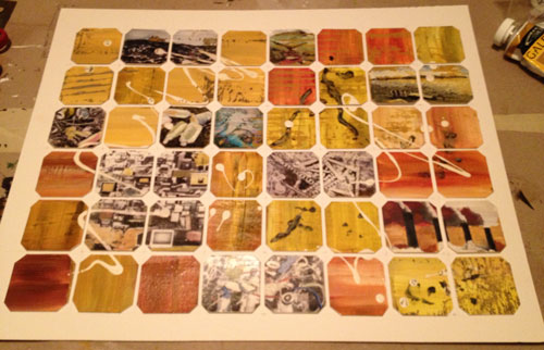
OK. I like how it looks. I'll need other references to the solar panel grid for it to make sense.
reading ::
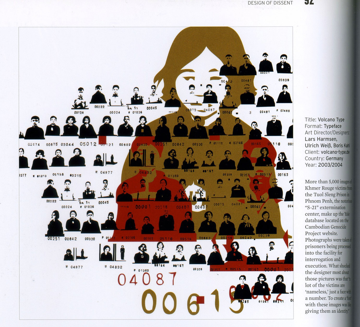
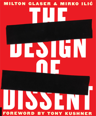 The Design of Dissent - Milton Glaser and Mirko Ilic
:: excerpts I found interesting:
Foreword by Tony Kushner (2005)—
...successful instances of graphic dissent (share) at least three characteristics: It is shocking, it is clever—even funny in a grim sort of way—and its meaning is instantly intelligible. And perhaps it shares one other characteristic: It is, or at least it seems to be, samizsdat, dangerous, forbidden. Resistance is sending up a signal flare in the darkness...Some galling truth that has yet to be organized, formulated, that can't even be spoken out loud, that can be only grumbled and whispered, some truth that lies imprisoned beneath the surface of public discourse is suddenly, finally liberated, shouted at great volume, a cry of rebellion carrying everywhere at once, a cry all the more powerful for being entirely silent, expressed by cartoon, entirely visual, needing no words, as if to say, by saying nothing at all: "We all know this truth, all of us have always known what's represented here, that's why it's so recognizable. And it's time to declare the secret in openly public places; it's time to act." As Freud warns us, when the repressed returns, it does so with immense force.
...The political is the arena of the miraculous, where the collective and the communal, so routinely repressed, so viciously suppressed, states its returns, where eternal truths and immortal edifices can dissolve in an eye blink, in historical time, where change rather than stasis is the only constant.
...What's miraculous is not that great graphic design, employing shock, wit, and clarity borne of urgency, can move people to action, to acts of courage and sacrifice, overcoming habit and fear. Art can do that; art is always having those sorts of effects. Art can't change anything except people—but art changes people, and people can make everything change.
...Politics is impure, political actors human and fallible, and the battles of opposites are never sharp edged. Twenty-first-century admirers of great political graphic design can't banish an uneasiness in appreciating design's power to catalyze change. We've seen too often how great design successfully sells monstrous lies, and we know how closely related to the whole process of selling and branding, of merchandising and commodifying, how intimately related to business, to commerce, all graphic art is. The marketplace created graphic design, its vocabulary, its ether.
So great is our knowledge, in the early years of the twenty-first-century, of all that has come before us, so vast is our experience of both human success and also staggering, holocaustic failure, and so sophisticated is our understanding of how little we understand, how vaguely we understand, that a toxic cynicism pervades our spirit, shutting down our capacity for faith, for hope, for imagining change—and consequently shutting down our passion, our imagination. These posters, these works of art, have a restorative power. Each is an argument that stamps itself indelibly in on the soul of the passer-by; accepted or rejected, the argument, the claim, or demand each makes becomes a spark in the dialectical engine of consciousness, of human life.
First, the word samizsdat caught my attention.What on earth was that?
SAMIZDAT:
> (Webster's Dictionary) a system in the Union of Soviet Socialist Republics and countries within its orbit by which government-suppressed literature was clandestinely printed and distributed;
>(Wikipedia) was a key form of dissident activity across the Soviet bloc in which individuals reproduced censored publications by hand and passed the documents from reader to reader. This grassroots practice to evade officially imposed censorship was fraught with danger as harsh punishments were meted out to people caught possessing or copying censored materials.
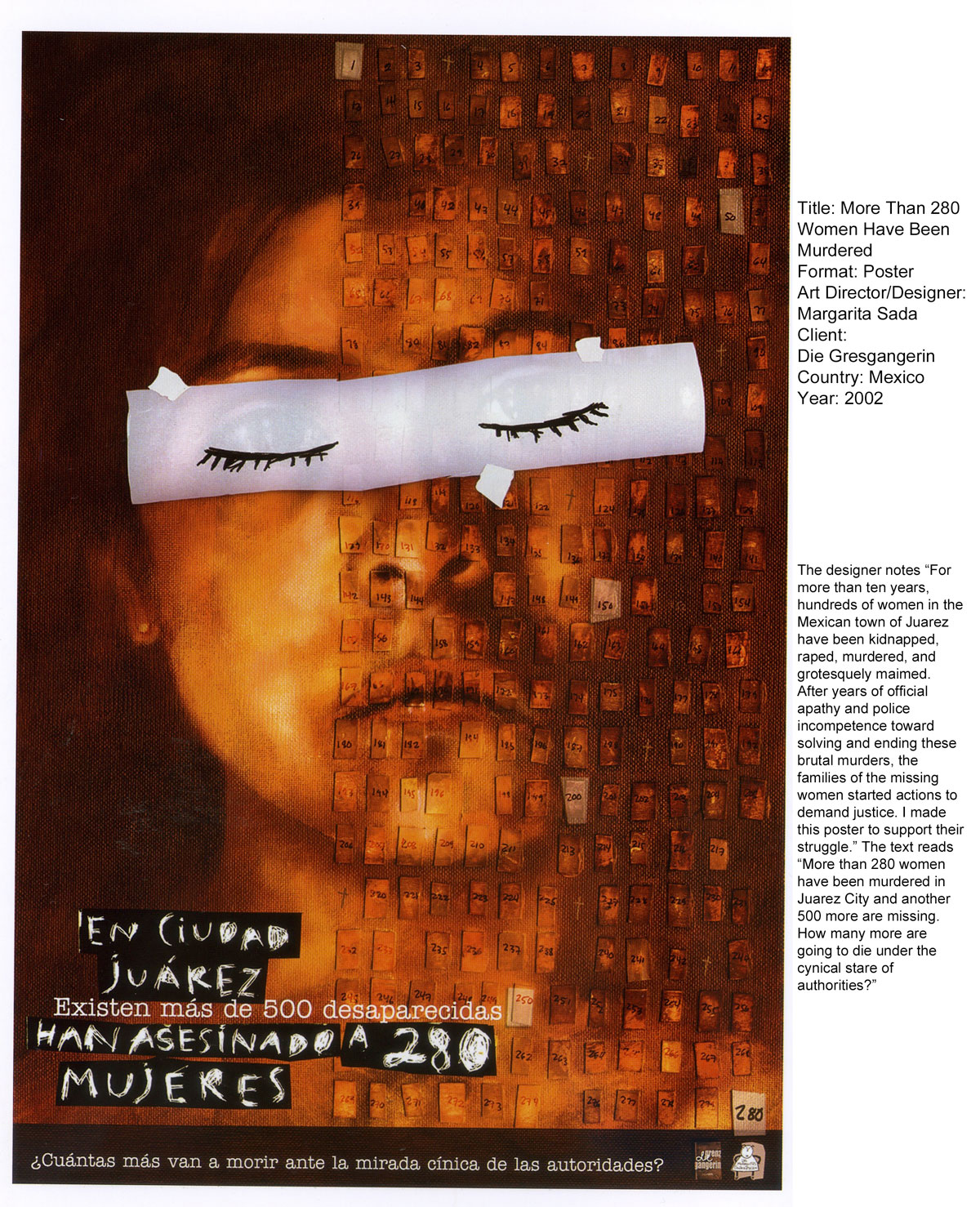
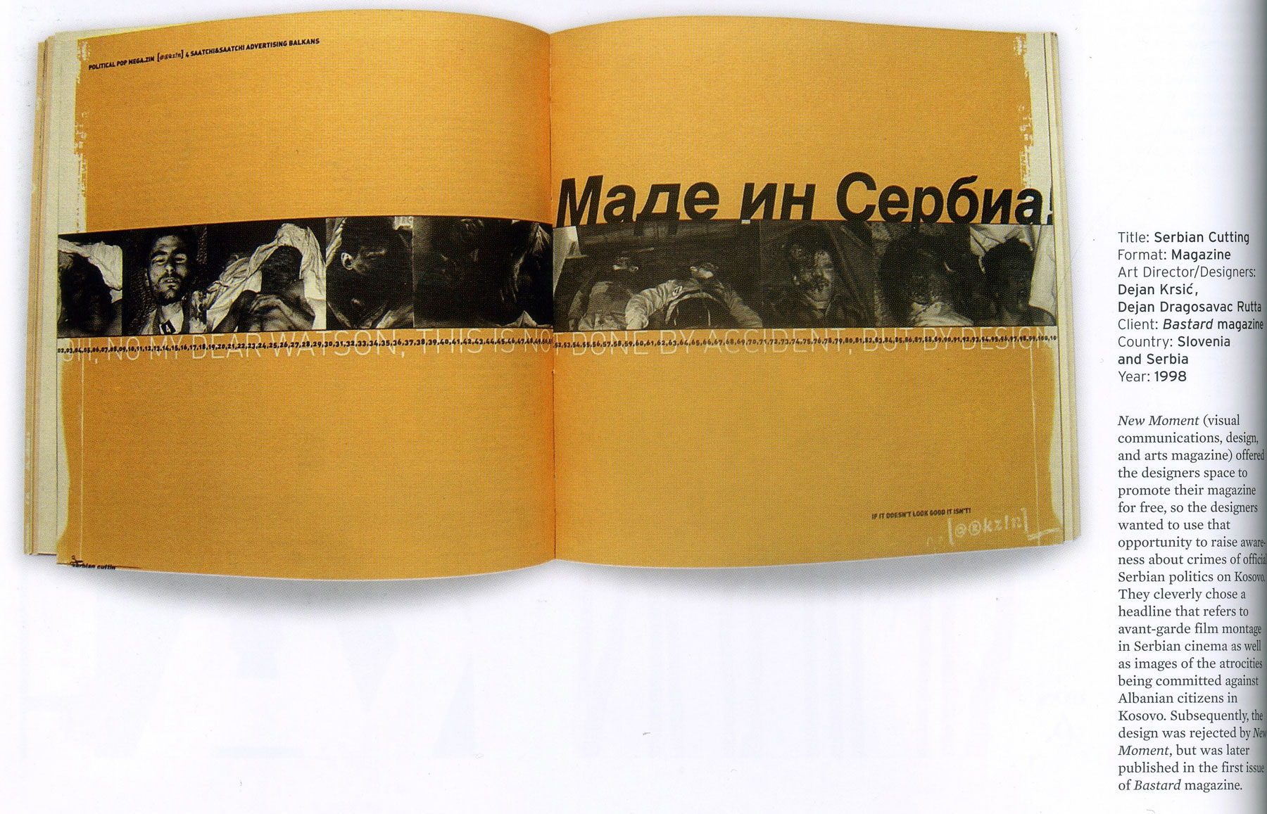
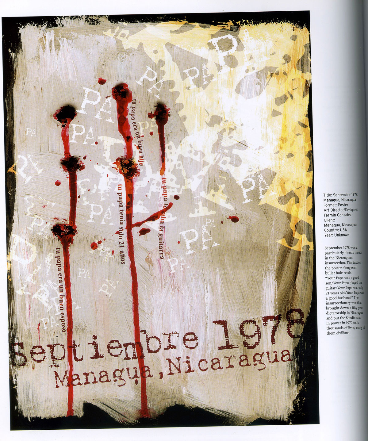
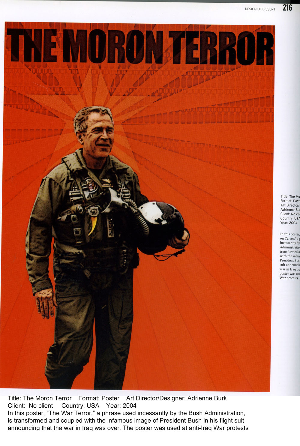
Kushner encapsulated so much of my frustrations here in his foreward to the Glaser/Ilić poster collection. I found so much inspiration in some of these posters.
Here are a few:>
(click on the thumbnail to see a larger image)
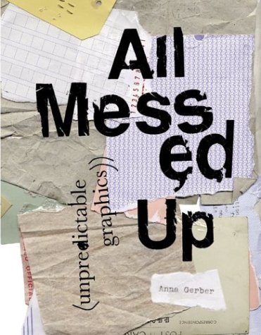
reading ::
All Messed Up - Anna Gerber:: excerpts I found interesting:
 No matter how hard we try to control the creative process, it is inevitable that we encounter an element of unpredictability—something unexpected.
In striving for perfection, we make mistakes...And sometimes these mistakes and accidents end up working to our advantage—to the work's advantage. To embrace this is to override the long-prevailing preconceptions that enforce the "badness" of mistakes and accidents.
Despite the derogatory associations of the word "accident," we live in a flawed world where things go wrong, where things inevitably fail. We also live in a world where, in order for progress to occur, things need to go wrong. The world needs accidents.
I had a teacher in undergrad, Richard Leuhrman, who praised and celebrated "happy accidents." I always wanted to master the medium and control how it behaved. It wasn't until much later, even after grad school (the MA) that I truly started to discover and enjoy those "happy accidents."It's a challenge to accept the idea that things need to go wrong in order for progress to occur, but intellectually I get it. So many things were discovered by accident. I've had successes emerge from accidents that were at a much higher level than what would have occurred through the initial plan.
To invent the ship was also to discover the ship wreck; to invent the train was to invent its derailment. —Paul Virilio, French social theorist, 2003
"Each period of technological development, with its instruments and machines, brings its share of specialized accidents, thus revealing en negatif the scope of scientific thoughts."
There are some folks who haven't figured out how to handle their technology—like those folks who think they can text while driving their 2,000 lb. "death torpedoes" down the highway. I don't think that's the kind of specialized accident Virilio was talking about though. Or maybe so?My best guess for en negatif is "in a negative light." Not necessary to throw a French curve at readers.
Ed Van Mergen—"The Art of the Accident" conference contributor, 1998:
– "voluntary sought risk"
– the accident "reveals the true identity of an object", that we have to stop negating the concept of "the accident" and start dealing with it in a much more productive way.
"beneficent error"
Ahhhh, these words.
I discovered the Visual Thesaurus today.
Odo Marquard, philosopher—"In Defence of the Accidental"
– accidents make us human and without them we would lose our sense of freedom.
In late 1970s, Brian Eno and painter Peter Schmidt, influenced by John Cage's Chance Theories, conceived of a deck of cards which they named "Oblique Strategies." Each card had a cryptic suggestion printed on it such as, "Honour thy error as hidden intent,"...
Went to their website (http://stoney.sb.org/eno/oblique.html)and here's the "card" I drew:
"Make a sudden, destructive unpredictable action; incorporate"
Hmmmmm....what can I destroy?
N. Katherine Hayles— "The Art of the Accident" —
"The problem with plans of any kind, of course, is that they are limited by our intentions. And our intentions are limited by what we (already) know...how do we get out of our own way?"
Remembering what Virilio said, it is important to create a space where accidents, nuances, disruptions, irregularities, the imperfect and the unexpected can all co-exist. This space exists in order to remind us that there is such a thing as beneficent error, that not all error is bad, that not all failure is to be avoided, that not all that is unplanned or unexpected need be an obstacle and that if we recognize these subtleties, we can encourage the unpredictable to take center stage in the creation process.
I can't help but wonder now how the systems I was reading about in Thinking in Systems (D. Meadows) fits into this equation. Strange that I chose the word equation. My vocabulary even tightens up when I think of planning and systems.Remember the Balancing Loops?
This is how my brain works, non-stop.

[Just a reminder, in this illustration, the "inflow" is the heat from the furnace, the "stock" is the room temperature, and the "outflow" is the heat escaping to the outside.]
I chose this illustration to compare here because the discrepancies between desired/actual temperatures is similar to the influence an accident has on the "stock" (the room temperature, but in this case, artwork).
Remember, "A system can change elements but still behave the same (i.e., a football team can get new players, but it's still football)."
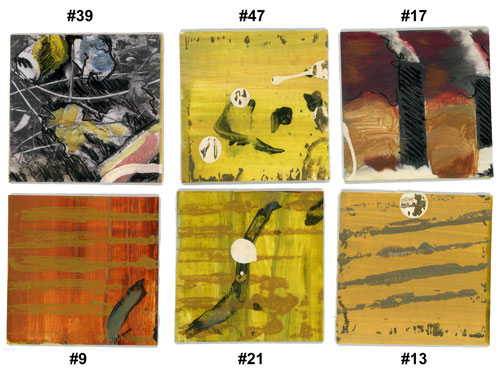
I've captured some images from this book that inspired me:
(click on the thumbnails to see larger images)


back to art making:
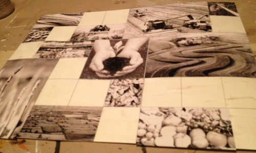
:: I was feeling withdrawals from painting, so it was time to return. I wanted to do another piece like The Mess We Make gridded painting I did at the beginning of this packet. My new inspiration came from watching a documentary (because I wanted a break from reading) titled "Food Fight" by Chris Taylor. It discusses sustainable and organic living, farming, food, and our global agricultural practices. It compared home/locally grown foods with that found in a supermarket. It illustrated how trapped we are in our current industrial agriculture system and how some folks are taking grass-roots approaches to changing local food consumption and production. One memorable quote was from Alice Waters of Chez Panisse in California, "good food should be a right, not a privilege." The film got me fired up when it shared the political incentives /subsidies given to corn and soybean growers, but not to those who grow the food we eat, and in a structure that promotes monopolization of farming. Grrrrr! This is just like the energy sector. The system is built to remove individual empowerment and make us all dependent.So, impassioned, I began...The Sanctity of Food
I started in Photoshop to work out the decisions of visual elements, color, and compositional structure. The white grid lines were built in Illustrator first and brought into Photoshop. This will serve as a guide.

I found imagery to work into the composition. I converted them all to b/w and altered their saturation and contrast to give me more to work with as I added color back into them. A final coat of gel medium prepared the entire surface for the acrylic paint to come.
I take an artist's pen and go into the imagery giving them more contrast, texture, and character. Then, let the painting begin!
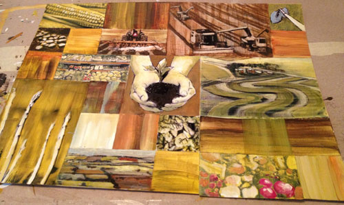
Earth hues, exaggerated brushstrokes, glazing , spot coloring for accent, but it needs something else...oh yeah...
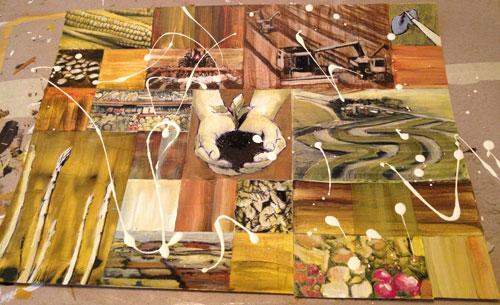
dribbles that will organically reconnect the squares after they're cut apart. There was an image of a pitchfork that I still want to incorporate, somehow. Will have to think on that one.
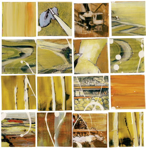
...before the dog-earing, here are a few,
and a close up of the asparagus (love it!).

...and a couple more, just because I think they're gorgeous!
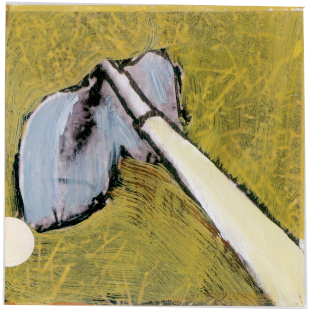 These are 2"x2"
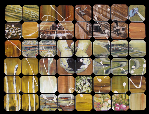
The finished piece: "Sanctity of Food"
As you can see, the pitchfork did not make it in. Seemed it would be too busy. Some squares just needed to be squares.
reading ::
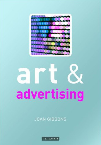 Art and Advertising - Joan Gibbons
:: excerpts I found interesting:
Still frequently misunderstood and often ridiculed, contemporary art has, nonetheless, become a significant force in popular culture, largely because of its sensationalism and media friendliness.
Immanuel Kant: In his “Analytic of the Sublime” argument he states that with the unquantifiable magnitude and force of nature, the human subject undergoes an experience of self-knowledge that constitutes the sublime. It is not, in the end, pain or fear that is experienced at not being able to conceive of nature’s ‘totality’ or ‘finality’ but great pleasure, the pleasure of insight into one’s own limitations, what is often now referred to as reflexive knowledge. As a state of mind or being in which the subject comes to realise his or her own intellectual limitations, the sublime serves not to reduce humanity in relation to nature but to rescue it. To have this capacity for self-knowledge and self-reflexivity, to be able to conceive of not being able to conceive things beyond the reach of the human mind is what, for Kant, distinguishes humanity.3
[Immanuel Kant, The Critique of Judgement (1790; Oxford: Oxford University Press, 1952), 61–4, 82–9.]
Despite (or perhaps because of) its lower status, most people feel more at home with the idea of advertising than with art, even when they are unhappy about its moral probity. For many, advertising constitutes a more readily understood category of representation, more attainable because of its status as a mass medium and more definable because, no matter how unconventional some of its practices are, its function can always be reduced to matters of promotion and persuasion, making it easy to categorise.
...the differences between art and advertising are not so much a matter of the intrinsic properties of each field of representation; they are more a matter of classification brought about largely by the institutional organisation of culture in the West.16
[Foucault’s work on the ordering of knowledge and social practices is well known through the histories he has drawn of sexuality, medicine, criminal discipline and insanity. Here, I refer more specifically to the methodological advice given in The Archaeology of Knowledge (1969), trans. A.M. Sheridan Smith (London: Routledge, 1992), 21–40, 178–95.]
What emerged with the incorporation of words into art in all of these major movements was a fusion of the verbal and the visual that has made it possible to speak of words in terms of their visual presence as well as their linguistic content. The ways in which words can add to the signification of the work has been crucial from the early days of their incorporation into modern art. The introduction of printed letters into early twentieth-century avant-garde art, for example, has been seen not only as a critique of the institutional boundaries between art and the mass media, but also as a subversion of the power relations between them.3
[J. Abbott Miller, ‘Word Art’, Eye (1993), 38–9.]
I’ll warn you, this book is packed full of citations. It almost seems that she strung along one after the other with little of her own perception. She offers more of her own thoughts toward the end of the book (the only reason I finished it.) I’ll start interjecting soon. I’ll let her set the stage for now.Here are some visual comparisons between art and advertising Gibbons makes:
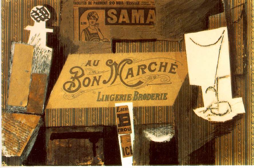 Picasso - Au Bon Marche, 1913 |
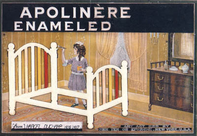 Duchamp - Apolinere Enameled, 1916-17 |
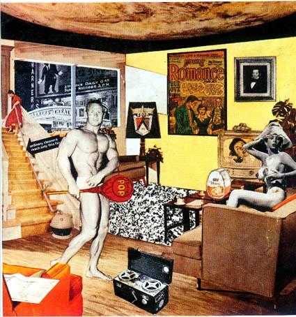 Richard Hamilton - Just What Is It That Makes Today’s Homes So Different, So Appealing?1956 |
 Joseph Kosuth - Art As Ideas As Ideas, 1967 |
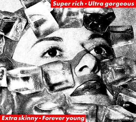 Barbara Kruger - Super Rich, 2007? |
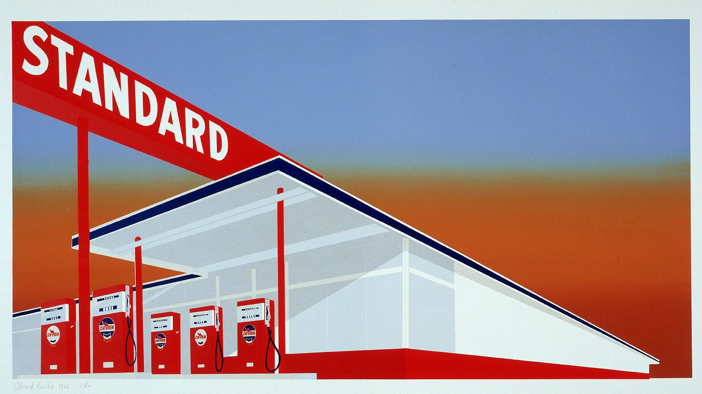 Ed Ruscha - Standard Station, 19 |
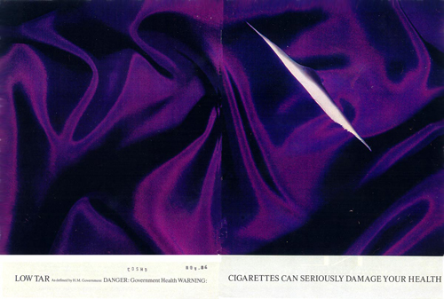 Jenny Holzer (for Saatchi) - Silk Cut cigarettes campaign, 1980s? |
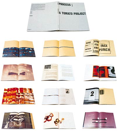 Steve Baker - Process; A Tomato Project I requested this book from my school’s library system. |
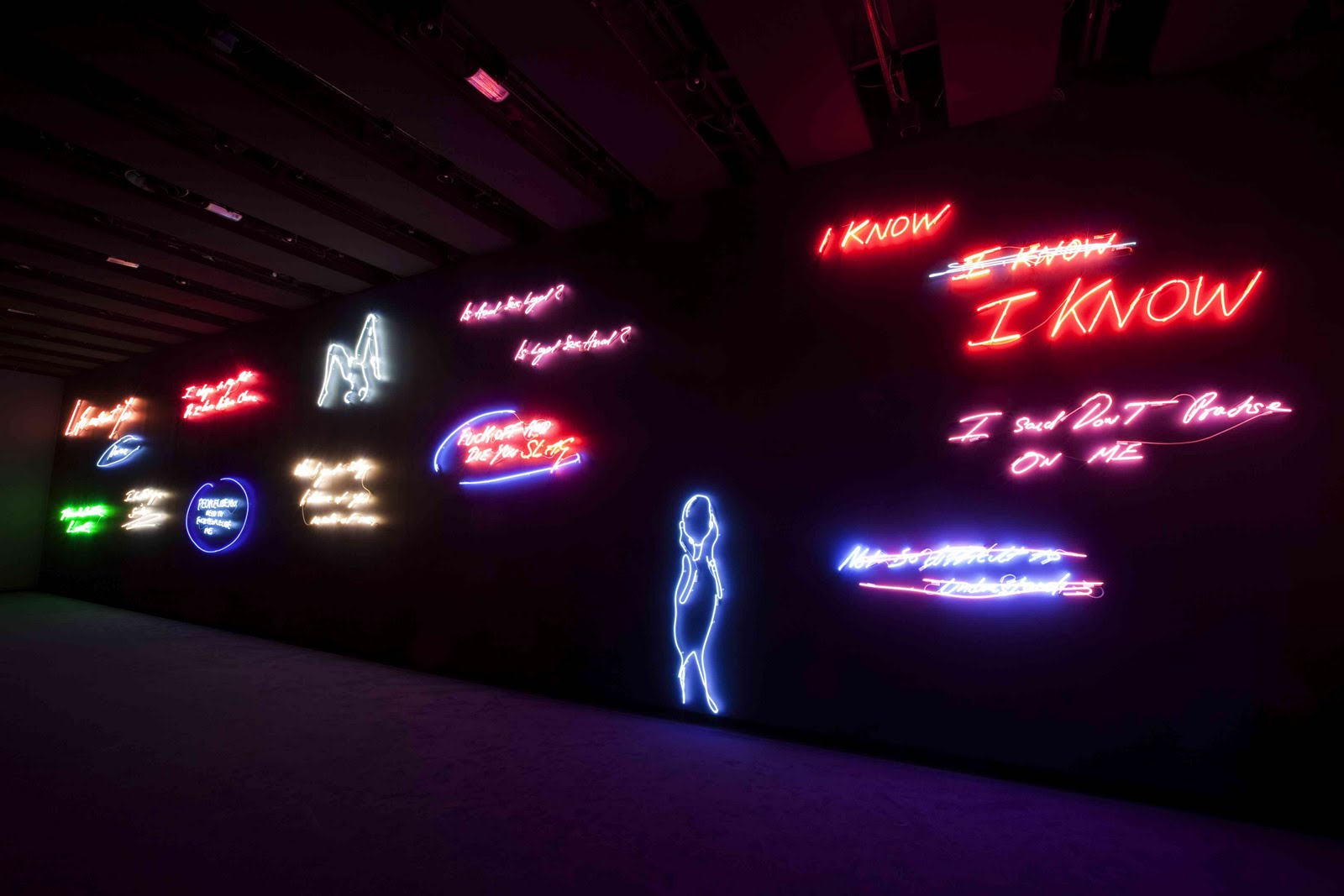 Tracey Emin - Neon Typography |
In the 1970s, a seminal embrace of subjectivity took place at Cranbrook with the appointment in 1971 of Katherine and Michael McCoy as cochairs of the design department. This was a time when graphic design was led internationally by Swiss-style, post-Bauhaus graphics, represented for instance in the highly ordered work and ‘universal’ typefaces of Josef Müller- Brockmann. Much has been made of the intellectual base that the McCoys established at the Academy that took in a broad range of post-structuralist theory, from the political philosophy and cultural criticism of Jean Baudrillard to the phenomenology of Maurice Merleau-Ponty.32 In effect, the absorption of a range of theories that preached the uncertainty of universal truths and laid emphasis on the contiguity of the moment facilitated a paradigmatic shift. The so-called functionalism of modernist design was replaced by individual approaches which reflected the ‘complexity, variety, contradiction, and sublimity of life’.33
[Katherine and Michael McCoy, in The New Cranbrook Design Discourse, 14.]
Although this more subjective approach to graphic design has been criticised by critic Rick Poyner for an overemphasis on self-expression, it actually helps confirm just how close art, graphic design and, by extension, advertising have become.34
[Rick Poyner, ‘Here is me!’, in Obey the Giant: Life in the Image World (London: August Media, 2001), 65–7. Poyner worries that ‘the desire for self-expression goes hand in hand with a deep reluctance to take up a position, to say anything definite about anything…’]
The popularisation of these more subjective and intuitive approaches in typography is without doubt due largely to David Carson. Indeed, as founder and editor of specialist youth magazines such as Beach Culture (1989–1992) and Ray Gun (launched in 1992), Carson may be said to have been a significant force in raising the visual awareness of subcultures that have in general been
characterised as disaffected...
Simultaneity = David Carson’s work
or, “all-at-onceness” (Marshall McLuhan)
The infamous lack of legibility in Carson’s intuitively developed works has meant that they connect first and foremost on an emotional level. From this point of view, Carson’s intuitive approach can be seen as part of an overall tendency in cutting-edge contemporary advertising that prioritises ‘attitude’ and often emulates the more open and intuitive methodologies associated with art.
Lack of legibility is right. Never cared much for Carson. I prefer to maintain as much typographical integrity as possible. Someone spent a lot of time designing the architecture of a font and I wouldn’t wanting someone to distort or disassemble one of my pieces to the point of oblivion.Art moved into the streets at a time when the gap between the haves and have-nots in society was visibly widening. It was a time when the social infrastructures of both America and Britain were being seriously undermined in favour of private enterprise and individual gain; a time when the avant-garde in art was in the process of redefining itself, prompting a number of artists to embrace the forms and techniques of the mass media in order to deliver oppositional messages in an accessible manner. Obviously, an industry such as advertising was prominent in the ‘spectacularisation’ of the entrepreneurial and consumer expansion of the 1980s, along with other forms of mass media such as glossy magazines, film and television, all of which are dominant cultural mediators that also act as popular mentors. It is no coincidence then that a number of artists who had matured in this media culture chose to express their criticisms of its values by inserting themselves into the arena of that culture, adopting and parodying its forms. Yet, ironically, many of the artists who opposed the status quo were also to profit from the economic boom of the 1980s, when the art market notably improved for members of the contemporary avant-garde.4
[Richard Bolton, ‘Enlightened Self-Interest: The Avant-Garde in the 1980s’, in Grant H. Kestner (ed.), Art, Activism, and Oppositionality: Essays from Afterimage (Durham and London: Duke University Press, 1998), 24–8.]
As Richard Bolton put it, artists had to ‘negotiate the space between high art and mass culture, between the elite audience and the general public, between rejection of the system and acceptance of it’.6
[Richard Bolton, ‘Enlightened Self-Interest’, 44.]
Vance Packard,...while questioning the role advertising played in American consumerism, clearly conflated it with the notion of indoctrination associated with communism, citing Americans as the most manipulated people outside the Iron Curtain.8
[Vance Packard, The Hidden Persuaders (1957; Harmondsworth: Pelican, 1962), 9.]
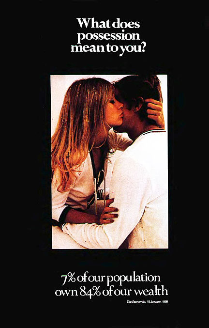 In Britain, it was Victor Burgin’s series UK 76 (1976) that was instrumental in the resurrection of the notion of a socially relevant poster art. A now renowned poster – What Does Possession Mean to You? 7% of our Population owns 84% of our Wealth – illustrates these hard-hitting statistics with an image of romantic fulfilment and sexual promise typical of the consumer advertising of the period, ironically turning the strategies of consumer advertising against themselves and exposing the contradictions of capitalism.
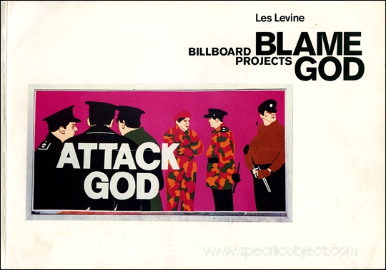
Les Levine - Blame God, 1985
Les Levine - Disposables, 1966
… by nature of using advertising, it is simply not enough to create images that are interesting to the art world, or that are titillating or provocative on a political level. One must make images that absolutely put your life on the line. That’s what people need from artists, that they’re willing to put themselves out on a limb. [The Blame God posters are] very hot images and, as it is with any hot thing, they can be bounced around by many people at different levels.30
[‘Extracts from a Conversation Between Les Levine and Declan McGonagle, ICA London, 8th September, 1985’, in Blame God: Les Levine Billboard Projects (London: ICA in association with the Artangel Trust and the Orchard Gallery, Derry, 1985), 43.]
(Declan) McGonagle notes that the fiercest resistance to Levine’s work came from his staunchest Christian critics who were, of course, particularly angered by the inverted message that Christian societies are actually killing, starving or bombing.35 Both McGonagle and Levine pointed out that advertisements that promote cancer-giving products or demean women tend to escape public censure. In other words, the Blame God campaign outed not only the hypocrisy of the traditional Christian church but also the hypocrisy of traditional advertising practices that made superficial promises towards an improved quality of life but, in the long run, were detrimental to the quality of people’s lives. In this, Levine made serious demands of his viewers, asking them to read deeply rather than superficially and, in this respect, he shared approaches practised by several other artists working in public spaces.
[It was Artangel’s support which enabled the purchase of commercial sites. Levine and McGonagle, ‘Extracts from a Conversation Between Les Levine and Declan McGonagle’, 53.]
1974 - French theorist Henri Lefebvre: recognised that there are ways of appropriating public spaces to turn them into sites of resistance against the controls of the dominant culture.54 For Lefebvre, appropriated space is situational, a matter of creating and responding to situations, a place for actions and interactions, expressiveness and revolt. Significantly, one of the ways in which space becomes situational is again through the world of signs and images.55 Lefebvre comes close here to the notion of detournement put forward by the Situationist International, a radical association, formed in 1957, that was made up of a broad spectrum of people who shared similar counter-cultural values, including philosophers, writers, artists and architects.56 Detournement – literally ‘diversion’ or ‘rerouting’ – meant finding ways in which the environment could be subverted in order to make people critically aware of their ‘situation’.
[54. Henri Lefebvre, The Production of Space (1974), trans. Donald Nicholson-Smith (Oxford: Basil Blackwell, 1984).
55. Ibid. 164–8, 362–3, 373–9, 389, 410–11.
56. Simon Sadler, The Situationist City (Cambridge, Mass.: MIT Press, 1999), 17–19, 108–10.]
Leaders in the field of current ‘social advertising’ are Saatchi & Saatchi, who have a substantial record of producing high quality social-cause campaigns. Numerous examples of Saatchi ‘social advertising’ from branches of the Saatchi & Saatchi agency worldwide can be found in Social Work: Saatchi & Saatchi’s Cause-Related Ideas, a publication which accompanied a travelling exhibition of their public service posters.59 These include a well-known pioneering example, Pregnant Man, for the Health Education Council in 1970, and the uncompromisingly illustrated Women and Children First poster for Greenpeace (1996),...
[Mark Thompson (ed.), Social Work: Saatchi & Saatchi’s Cause-Related Ideas (London: Saatchi & Saatchi, 2000).]
Art and advertising came even closer together from the late 1970s to the present through the development of signature styles in advertising campaigns. While building brand identity through the deployment of a distinctive type of imagery, several major campaigns played down the product itself and developed strategies that were alien to advertising but familiar in art.
The rapid emergence of a consumer boom and commercial competition in post-war America meant that advertisers had to concern themselves with finding ever more effective methods and strategies.

Saatchi,
Benson & Hedges -
Pure Gold campaign
CDP,
Benson & Hedges -
Pure Gold campaign
There are two major texts on motivational approaches in advertising from the period: the first, by Vance Packard (1957), was highly critical of subliminal methods; and the second is by Ernest Dichter (1960), who was highly in favour of them.6 Both of these texts describe examples of motivationalist approaches put into action, evidencing an ideology based on the fulfilment of desire or the allaying of anxieties through consumerism. In their attempts to influence consumer decisions, advertisers embedded their subliminal messages in narratives of desire, possession and fulfilment in an approach that has since been termed Capitalist Realism.
[Vance Packard, The Hidden Persuaders (1957; Harmondsworth: Pelican, 1962); and Dr Ernst Dichter, The Strategy of Desire (London and New York: Boardman, 1960).]
Capital Realism:
1 - the emergence and formulation of German Pop Art in the early 1060s where it was one of the labels used to describe post-war consumer culture;
2 - mid-1980s, Michael Schudson used it as a label to describe mainstream practices in advertising
As with Socialist Realist art, advertisements, however ‘real’, do not ask to be taken literally but set up symbolic structures in which people and situations are typified and abstracted.
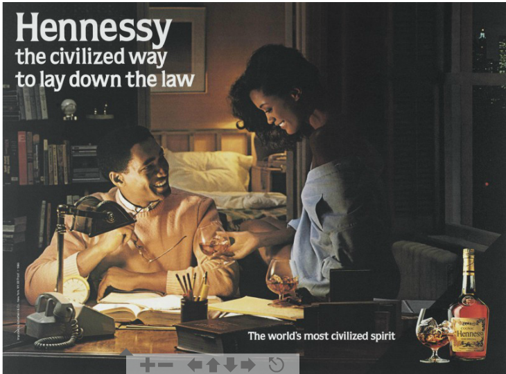
Jeff Koons, “Hennessey: The civilized way to lay down the law”, 1986
= upward mobility of minorities; painted illustration
...the economic boom of the 1980s brought home the need for advertisers to differentiate between and address an increasing number of new consumer groups. In what was by then a noticeably more pluralistic culture, conventional 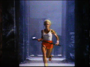 methods of consumer categorisation, such as class or income, were seen to be over-simplistic, if not counter-productive. The result was the development of new methods that approached potential consumers with more subtlety and creativity, abandoning the narratives of Capitalist Realism, although not necessarily abandoning motivationalist theory.19 This allowed for an unprecedented creative freedom in advertising and the production of exceptional works such as Ridley Scott’s "1984" for Apple computers (still image at right) or the enigmatic late-1980s Guinness campaigns featuring Rutger Hauer.
[Leiss et al., Social Communication in Advertising, 304–7; and Sean Nixon, Hard Looks: Masculinities, Spectatorship and Contemporary Consumption (London: UCL Press, 1997), 77–102.]
The disappearance of the product in postmodern advertising was matched by the embrace of consumer commodities as the subject matter in contemporary art. The products of mass production and consumer culture had, of course, already made an entry into the art of earlier avant-garde movements such as Cubism, Dadaism and Surrealism, and this sort of subject matter was to gain special significance for Pop Artists due to the huge boom in consumerism in the West following the Second World War. What is of concern here, however, is the foregrounding of the commodity and of the theme of consumerism the 1980s and 1990s in avant-garde art...
Jeff Koons’ series The New (1980–1986) consisted of brand-new vacuum cleaners in neon-lit Plexiglas showcases. On the one hand, these works seem to fetishise consumer objects that are ordinarily taken for granted and to call attention to the way that ‘consumerism appears to become ever more cultural, less the realm of selling things but of selling or merely displaying images, sounds and words.’46 On  the other hand, their isolation in the gallery, as Koons has claimed, recodifies the objects and also allows us to ask why and how consumer objects are glorified.47
[Julian Stallabrass, ‘Shop until you Stop’, in Grunenberg and Hollein (eds.), Shopping, 222.]
[Daniel Salvioni, ‘McCollum and Koons’, Flash Art, 131 (December 1986–January 1987), 66–7.]
Jeff Koons, New Hoover Convertibles, Green, Blue; New Hoover Convertibles, Green, Blue; Double-Decker, 1981–87. Vacuum cleaners, plexiglass, and fluorescent lights, 116 × 41 × 28 in. (294.6 × 104.1 × 71.1 cm). Whitney Museum of American Art, New York; purchase with funds from The Sondra and Charles Gilman Jr. Foundation Inc. and the Painting and Sculpture Committee 89.30a-v
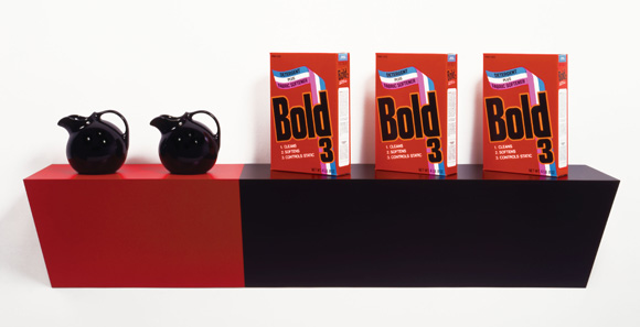
Haim Steinbach, supremely black (1985).
Steinbach similarly takes consumer objects and displays them on shelves, mimicking their presentation in shops: for example, supremely black (1985),... Again there is a strong sense of fetishisation and an opportunity to take pleasure in ‘objects that are easily accessible and interchangeable’, while also ‘being complicit with the production of desire’.48
[Peter Nagy, ‘From Criticism to Complicity’, Flash Art, 129 (Summer 1986), 46–8.]
As in a great deal of consumer advertising, the subtext of these works is often one of desire, or the fulfilment of desire. This creates a duality where the objects are offered both for critical scrutiny and for the pleasures that they represent. This dual representation of the object may be seen as symptomatic of the ‘anxiety of late capitalist culture’, which Steinbach defines as:
the futility we experience in value systems when faced with our reality; in the futility we find in moralizing as a way of determining what’s good or bad, and which is something perhaps experienced by both producers and collectors of art at their complicity in the systems of commerce.53
[Nagy, ‘From Criticism to Complicity’, 49.]
...disturbing subject matter is a common part of contemporary art, commercial art tends to be equated with pleasure and fulfillment. some commercial art has transcended into this framework. Example: Toscani’s “Shock of Reality” campaign for Bennetton
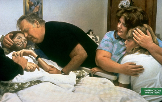
Oliviero Toscani for Benetton, AIDS – David Kirby (1992).
Shocking subject matter is not new in art, ...but begs the question of whether some things are possible in art, but not possible in advertising.
...convergence of attitudes and approaches, correspondences, overlaps and exchanges between both fields (of art and advertising)
(and practitioners like Oliviero Toscani, Luciano Bennetton, and Tony Kaye)
...Kaye’s work confirms that, while distinctions can be drawn between the roles played in the marketplace by art and advertising, this is not necessarily to do with the aesthetic parameters and content of the work which, in several notable instances are seen to correspond readily with one another. In other words, while belonging to different contexts of cultural production, art and advertising in such instances have come to operate with a similar degree of purchase in the symbolic economy of our times.
Kaye described as an “enfant terrible” would disregard client views in favor of his own expressive judgement.
...consequently, he is able to produce a rare type of advertising that clearly draws its creativity from individual vision and from the ability to activate the imagination of the viewer in a way that has on noticeable occasions invoked the grander narratives of our culture rather than the every day concerns of consumerism.
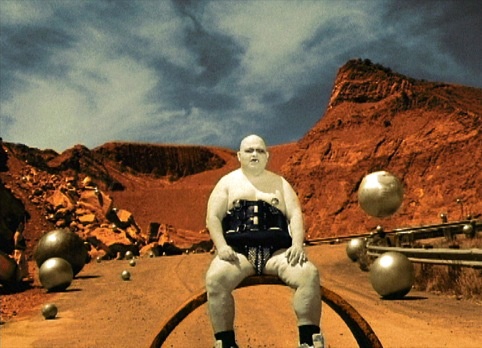
Tony Kaye, Unexpected (1994)
Constructivists, Dadaists, Surrealists who also willingly embraced materials and methods of commercial art, for avant gardists such as these, the project...would both involve the viewer and develop his or her political understanding.
(Wieden+Kennedy) In its involvement in cultural politics and its play with the politics of representation, Nike advertising may be said to have moved well into realms of critical practice that are normally the territory of non-commercial art forms. As in so many contemporary advertisements, references to the product and its material value are muted in favour of a brand image, which in this case attaches itself to values of another order that are concerned with the politics and problems of everyday life.
...this appeal to resistance recognises the daily pressures on women to conform to an ideal (one that is, in fact, regularly assisted by both the advertising and editorial content of women’s magazines) rather than to be themselves...
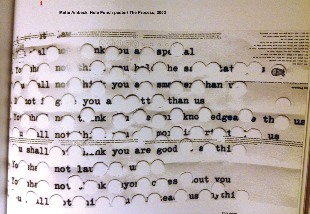
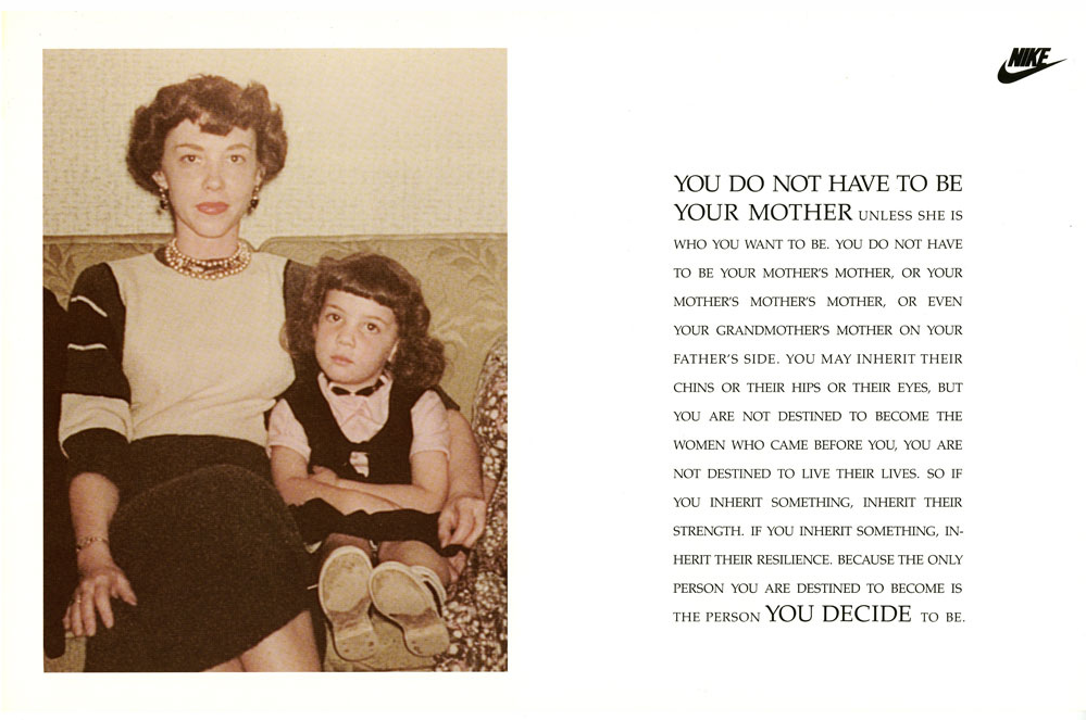
An example of this is Nike’s "Empathy" campaign (1991), which was predicated on the idea of talking to women in the way that women would normally talk to each other. Here, the advertisements were presented as a commentary on women’s formative experiences, tapping into women’s propensity for introspection and self-analysis. For example, the 1991 print advertisement, YOU DO NOT HAVE TO BE YOUR MOTHER (above), encapsulates the issue of self-determination. It speaks in the second person but instead of the usual commanding imperatives of advertising – ‘buy these trainers’ – the advertisement almost speaks in the voice of the therapist, reminding the viewer that she is in control of her own destiny and that the only person she is destined to be is the one she decides to be. be.
The female creatives at Wieden+Kennedy have taken one of the central tenets that informed feminist art to heart – that the personal is political. And, like many examples of feminist and postfeminist art, these advertisements speak of women’s personal narratives. An early example of this is given by Goldman and Papson, who quote from the text of the advertisement:
All your life you are told the things you cannot do. All your life they will say you’re not good enough or strong or talented enough. They’ll say you’re the wrong height, the wrong weight or the wrong type to play this or be this or achieve this… THEY WILL TELL YOU NO, a thousand times no until all the no’s are meaningless. All your life they will tell you no, quite firmly and very quickly. They will tell you no. And you will tell them yes.18
[Tate Gallery, Rites of Passage, 21.]
This was the most profound ad campaign I can remember. Probably because it spoke to me. Yay! to the women at Wieden+Kennedy....what brings these advertisements closer to art is the fact that they are discursive and invite reflectivity and critical engagement from the viewer.
Take that you art purists.In the 1990s...it is clear now that advertisements are frequently consumed for their added value as art or entertainment, where the experience is primarily aesthetic and/or a matter of amusement. This emphasis on the aesthetic and/or the entertaining in advertising is largely due to a surplus in production and a glut of competing, of the interchangeable, products in the marketplace.
Yes. Finally discussing the glut of consumer goods.
Cultural Capital - the accumulation of knowledge, competencies and goods that have been acquired in order to mark our a position in the rankings and hierarchies of society. Art, with its connotations of genius and exclusivity, has long been a signifier of this sort of capital, allowing those with knowledge, appreciation or ownership of “good” and “great” works to foster a sense of distinction by proxy.
...as boundaries between high and low have become more fluid and as social formations have become increasingly mobile and pluralistic, a shift in ethos has taken place...this shift in ethos can also be expressed asa move away from a consumer culture that validates through the notion of material possession - “to have is to be” - towards “self-identity as a kind of cultural resource, asset, or possession.” 4
[Warren Berger, Advertising Today, 148.]
Brands have been expanded by the corporation of key cultural themes and ideas to the extent that the brand often becomes the culture istelf rather than the sponsor or the representative of cultural values and icons, undermining the notion of culture as something that exists apart from commerce. 10
[Douglas Crimp, ‘Pictures’, in Brian Wallis (ed.), Art after Modernism: Rethinking Representation (Boston: Godine, 1984), 175–87.]
Michele H. Bogart studied the relationship between art and advertising in America up to the 1960s—an emergence of artists who embraced advertising. The notion that art could not only reach people effectively through advertising but also build a shared public culture was shared by several other noteworthy American artists in the early mid-20th century, such as Stuart Davis, Maxwell Parrish, and Rockwell Kent...21
[Nancy Princenthal, ‘Gillian Wearing at Jay Gorney’, Art in America, January 1998.]
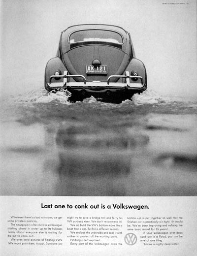
Advertising was to cultivate its own creative strategies and develop creative autonomy through the innovations brought by Bill Bernbach, the creative mind behind the highly playful and innovative Volkswagen Beetle campaigns of the 1960s.
...another set of new approaches was introduced into advertising by the "motivationalists" who sought to create a psychological dependency on the product rather than use it as a pretext for the dissemination of art.
These were the folks I developed a distaste for.
In the 1990s, certain artists, most often partonised by Charles Saatchi and known popularly as the young British artists, became media fodder. Through the media, the work of these artists became a form of entertainment and they themselves became celebrities.
...(Andy Warhol) can be seen as a special case in the history of the relationship between advertising and art in America because as an artist he worked against the ethos of Clement Greenberg’s clear demarcation of high art and popular culture, and ‘embraced the contradictions of being an artist in commerce.’ 25 In effect, the entrance of popular culture and the mimicking of the imagery and processes of mass production in Warhol’s art provided a clear challenge to the boundaries between high and low that Greenberg and others were trying so hard to fix, reconciling the tensions and narrowing the divide between the two. Moveover, working under the aegis of Pop Art, Warhol, of course, also had influence on the narrowing of the gap between high and low in the UK.
[Bogart, Artists, Advertising and the Borders of Art, 300.]
Re: Warhol works including images of Marilyn Monroe, Jackie Onassis, Brillo box, Green Coca Cola Bottles—
...despite, or perhaps because of, their origins in mass media, these works nevertheless expressed the idea of the American Way. Indeed, Warhol famously stated that America’s greatness lay in the democratisation brought by mass consumption: “A Coke is a Coke and no amount of money can get you a better Coke than the bum on the corner is drinking. All the Cokes are the same and all the Cokes are good.” 27
[Andy Warhol, The Philosophy of Andy Warhol (From A to B and Back Again) (New York: Harcourt Brace Janovich, 1975), 101.]
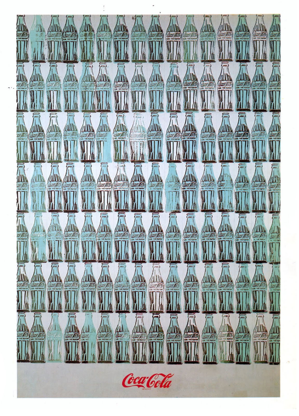
Andy Warhol, Green Coca Cola Bottles, 1962
This gives me an idea for my next project.
...continuation of the use of artist celebrity to promote product...
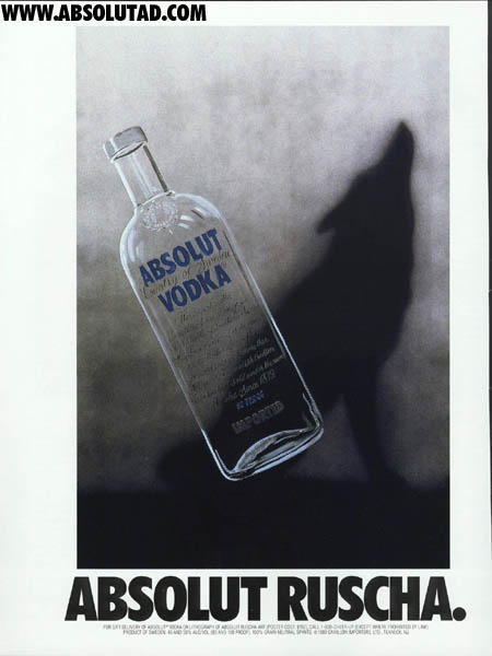
Absolut Ruscha by Pop artist Ed Ruscha, 1988
This was a very cool idea that Absolut had. It never seems to be exhausted.
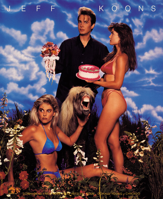
As with many of Jeff Koon’s works, the advertisements exude irony, presenting but also caricaturing Koons as an artstar. Koons sees himself as a second generation Andy Warhol.
Jeff Koons (*1955), Advertisement Art in America, November 1988
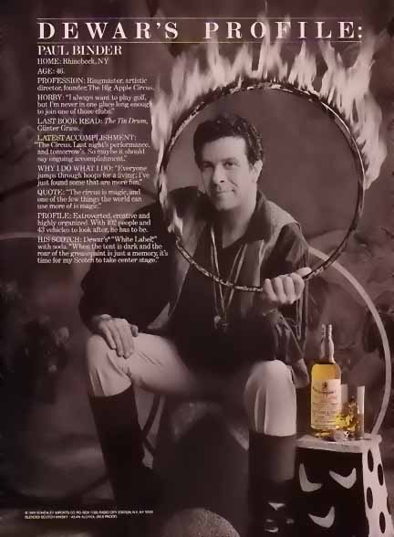
art/advertising for liquor (Absolut, Hennessy,
Gordon's, Dewars,...) = examples of mainstream
genre of Capitalist Realism
Consumerism and consumer lifestyle have, moreover, figured in the work of several contemporary practitioners: for example, Swiss artist Sylvie Fleurie makes consumer desire the subject matter of much of her work, such as Pleasures (1996); and German artist Olaf Nicolai’s book “Stilleben”, displays images of architectural spaces, “fashionable” people and designer objec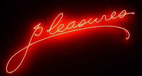 ts, in a way that foregrounds issues of lifestyle and market forces.60 Such works, while not stridently critical of consumerism, recognise its hold on the culture and set up a discursiveness around its forms and practices.
[Vincent Pécoil, ‘Brand Art’, Art Monthly, 265 (April 2003), 3–4.]
...the public identities the artists, along with their artworks, join a myriad flow of consumer signs that circulate in popular culture (not least the signs of advertising), functioning almost as brand identities among numerous other brand identities. Art and artists can be said to have become part of the spectacle of consumerism: part of a simulated world of dreams, fantasies, and desires rather than the “real” world.
Augh! We’re part of the problem.
Differences between art and advertising: purpose of advertising is to persuade and sell, the conditions of production and reception are controlled, advertising is produced to meet a brief and serve a designated purpose; art is “authored” where as in advertising it is difficult to track down the individual who actually create the works (because it is more collaborative).
My conclusion to this whole, tedious book, is this, there has always been a connection between art and advertising and at the same time, a disconnect. I don’t think there needs to be a notion of “high art” vs. “low art”. And I sure as hell don’t consider advertising “low art,” even though it is connected with marketing a message (not always for product). Both have influenced each other throughout history. It may be more obvious in the 20th & 21st centuries, but nonetheless, it’s been there.The reading of this book illustrates my stubbornness. I struggled with the first third of it but forced myself to finish. That is time I will never get back. Could I have been doing something more fruitful? Probably, but there was good information in this text (just very dry). I’ll copy her bibliography and pursue some of the articles/books she referenced on my own later. But for now, I’m done with this book.
continued art making:
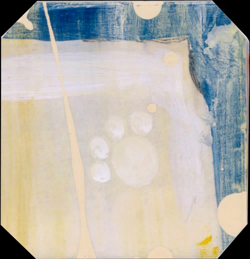
:: I was inspired by the Andy Warhol, Green Coca Cola Bottles, and wanted to continue with another grid composition. It reminded me of other posters I'd seen on industrialization and consumer societies. I decided to take inventory of my own cabinets and refrigerator. I'm a serious consumer it turns out. I wrote down some of the major categories of items. I then took pictures or found images of these and began to plan a guide for the next grid piece I decided to call My Own Consumption. 
I started with black/white imagery, used an artists' pen to build contrast and add sketchy texture to some areas, spot colored with acrylic paint, added washes/glazes, and the final dribble in off-white acrylic.
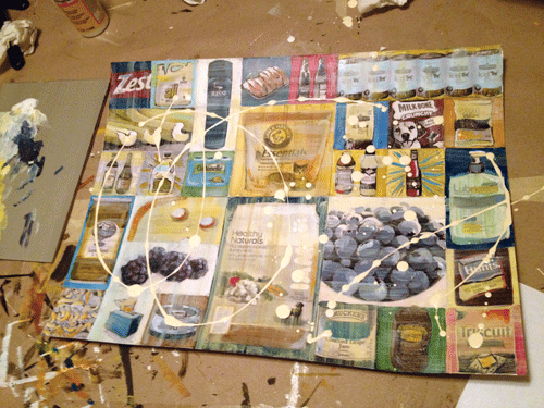
Then, I proceeded to cut them apart.
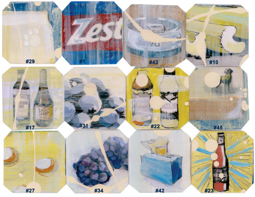
These are some of my favorites. Close-ups are below. Each square is 2"x2" like the previous works.
And finally, assembled.
I'll take a better picture soon.
I'll continue with the grid theme , there might be more like this one, and I might explore other options.
This wraps up the 3rd packet contents. I'm reading Thriving Beyond Sustainability: Pathways to a Resilient Society by Andres Edwards at night. Will be starting Mapping the Intelligence of Artistic Work by Anne West soon. It looks VERY inviting.